StubHub Interactive Seat Map | Super Bowl 2019
Overview
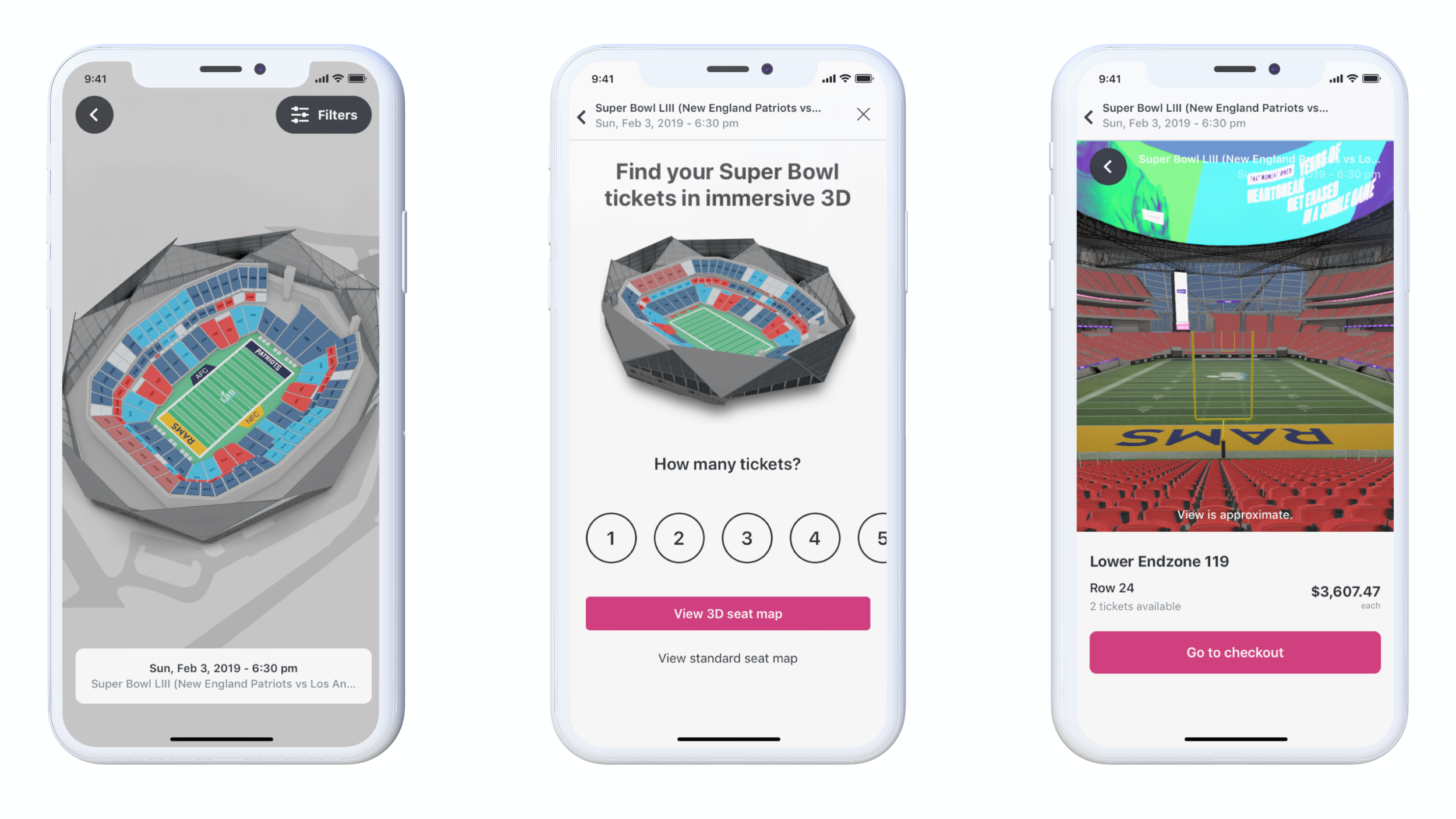
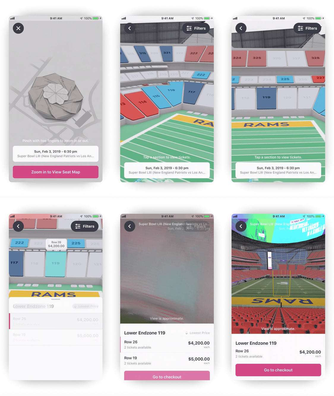
In partnership with StubHub, I represented Prolific Interactive as the Lead Designer and Project Leader to create a 3D ticket-buying-experience for Super Bowl LIII. For StubHub, this was an entirely new feature reserved for special events. Using this as a proof of concept, StubHub aspires to apply this design framework to other high profile events. Because of the engineering and design complexity, a feature like this isn’t realistic for every event in the app. I partnered closely with their internal teams to identify the key user flows, design interactions and UI components, create animations, unit test and pushed this feature live in just 12 weeks. We were also able to simplify the user journey by relying on SceneKit rather than ARKit 3 and eliminated redundancies (inline filtering and sorting with real-time available inventory) which can sometimes be challenges for exclusive events like the Super Bowl.
My Role: Product designer (ix + animation, ui, UX)
Channels: Stubhub native ios app
TEAM: ALlY Li (StubHub Engineering), Garrett Reeb (Project Management), Daniel Vancura (engineer), Guarav Kumar (stubhub Engineering), Jon Fulton (stubhub ux design), Virakri jinangkul (design technologist), alice hsu (stubhub Engineer).
Process
The Stadium
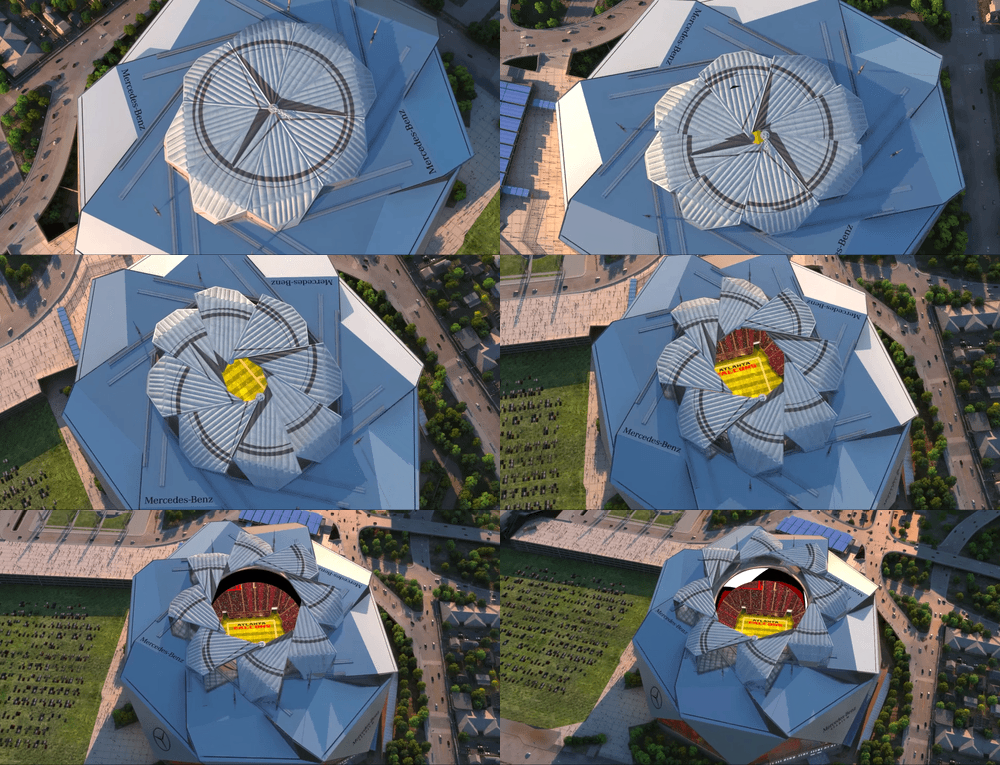
Mercedes-Benz stadium has a very unique architectural feature: it is 1 of 5 NFL stadiums that has a movable roof. 8 triangular panels weighing 500 tons each, called ‘petals’, move in straight lines when they open and close. We wanted the 3D map to showcase this piece and wanted to find a way to make this a key piece of the interaction.
Courtside Club User Personas
User Personas
The primary user types we built around were:
Buyers - Top tier buyer personas. This is StubHub’s highest value user in terms of buying power, usage particularities and lifetime value. (specific details are subject to confidentiality so I am unable to showcase the user persona particulars in this case study).
Browsers - Casual users who are more interested in the 3D feature experience than purchasing tickets. There are significant numbers of users who would interact with the feature that would not ultimately purchase tickets.
Takeaway: the utility of this feature would hinge on delivering an efficient but rich experience. It was incumbent upon design to create a succinct user flow with a minimum number of components allowing the 3D map to be the star of this feature.
“I will browse seats on my phone and wait to pull the
trigger until I have my laptop...just to be on the safe side.”
Our learnings from StubHub
Before I joined the team at Prolific they had previously launched a similar feature using a 3D map in Augmented Reality for Super Bowl LII in 2018. The goal of the feature was similar to the ticket buying experience I was asked to build with one key difference: users were not able to complete the purchase of their tickets using the AR experience. This was mostly due to technical limitations and the constraints of the design choices made at the time. Because of that disconnect, the feature usage was moderately successful but those challenges would directly inform our strategy for 2019.
1. The user wants a seamless experience
The critical benefit previous users had expressed interest in was to clearly see the 1st person perspective of their chosen tickets. With the previous AR build, users could browse sections (which contained dozens of rows) but there was no measure of accuracy down to a given row. We needed to remove this blockers to purchase by providing accurate 3D views of ANY AND ALL ROWS (there were almost 10,000 of them) at Mercedes-Benz Stadium.
2. The UI components had to be flexible and dismissible across the board
One of the main painpoints with the previous build was the preeminence of the UI components. Users expressed a distaste for the way that those components created a busyness on the limited screen real estate. With the rich details of the 3D map, we wanted to create a library of UI components that were fully dismissible (a la` Google Maps App) which would allow users to easily toggle back and forth between the full-screen map view and the feature cards that gave details and context to the map content.
3. Condensing the flow was key
Exemplifying good Product Design often hinges on right-sizing the user task into as simple of an interaction as possible. That meant capturing user inputs at the start of the experience and surfacing relevant results and allowing users to interact with the map to lead them to their perfect purchase.
4. Previous backend was not flexible
Because of the way that the previous build was coded, we weren’t able to use the previous build as a baseline for unit testing. We wanted to create an extensible set of UI components that StubHub could use on future builds and setup a backend that could serve as a framework for other events.
User Flows - “Know Before You Go”
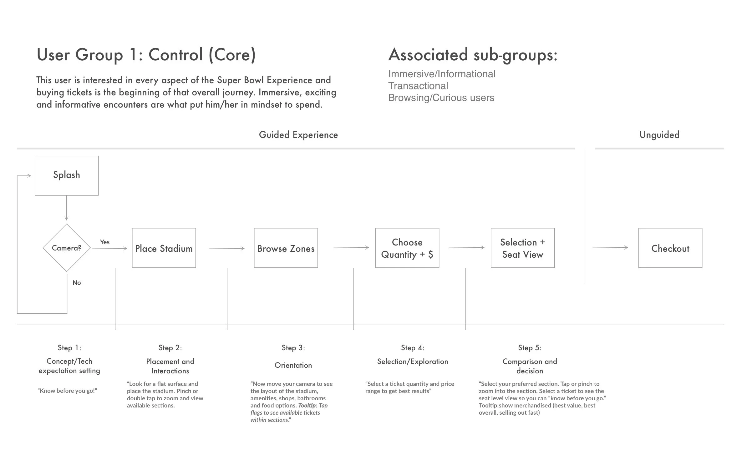
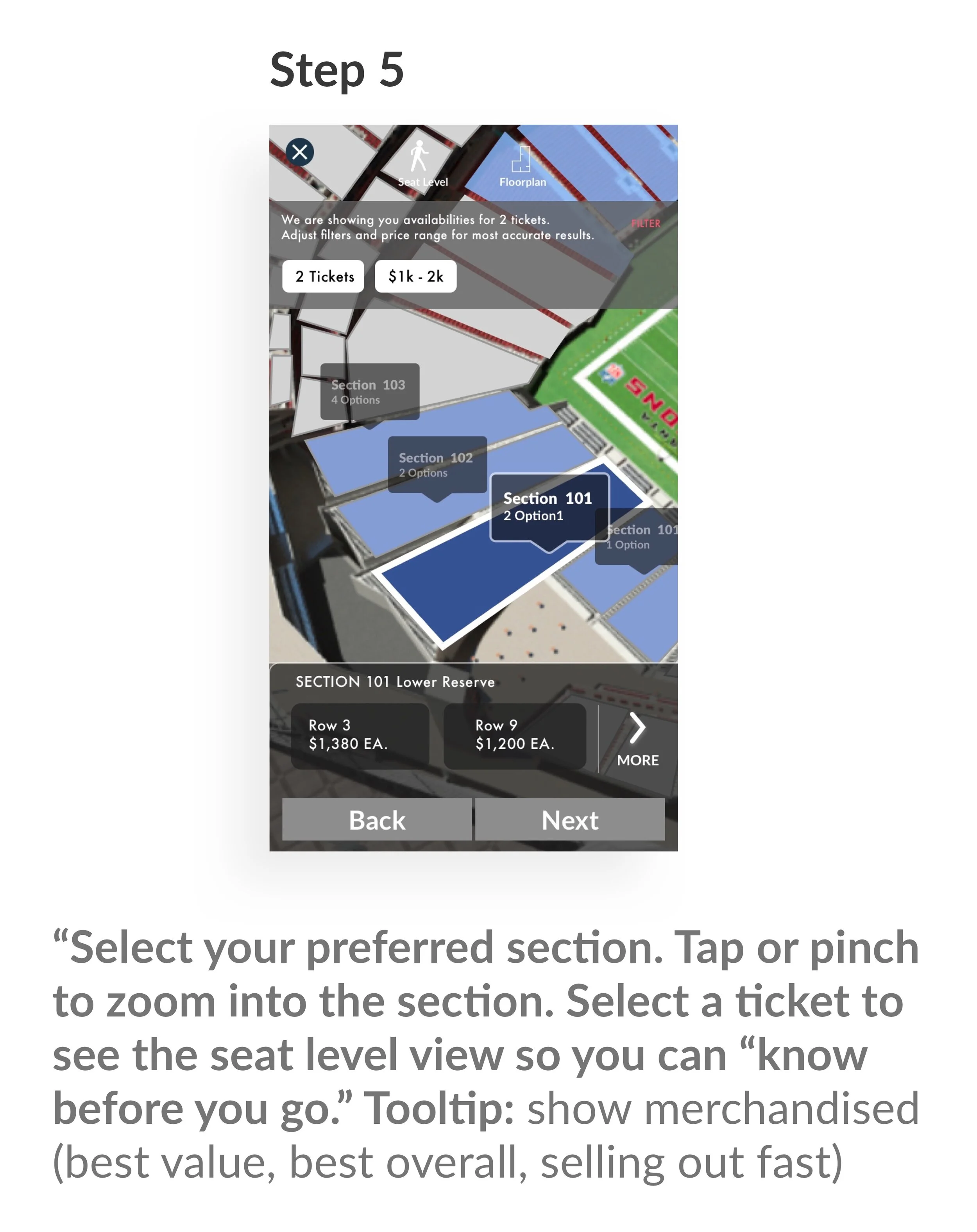
This feature was built to augment the existing checkout flows. The diagram below designates the build as “Guided Experience” which includes the rendering of the 3D map in real space, Browsing merchandised zones (“Best Value”, “Highest Price”, “Best View” etc.), Selection and 1st person views of the seats. This flow helped give users a unique view of their tickets which gave additional comfort/assurance given the high ticket price of this event. As a rallying cry, we used the design slogan “Know Before You Go” to keep us focused on the central principle of this feature.
The sequence above was appropriate for an AR build. However, in week 3, we pivoted into engineering a more traditional 3D map experience that used Apple’s SceneKit. In user testing the AR Kit experience proved to be too cumbersome. This changed the interaction so that the placement of the stadium was not necessary (Step 2). This was a major assumption that we made: users do not want to take the time to place a stadium because it adds friction to the interaction. This would prove to be true as we moved closer to final design. The key user flow that we identified looked like this:
Wireframes
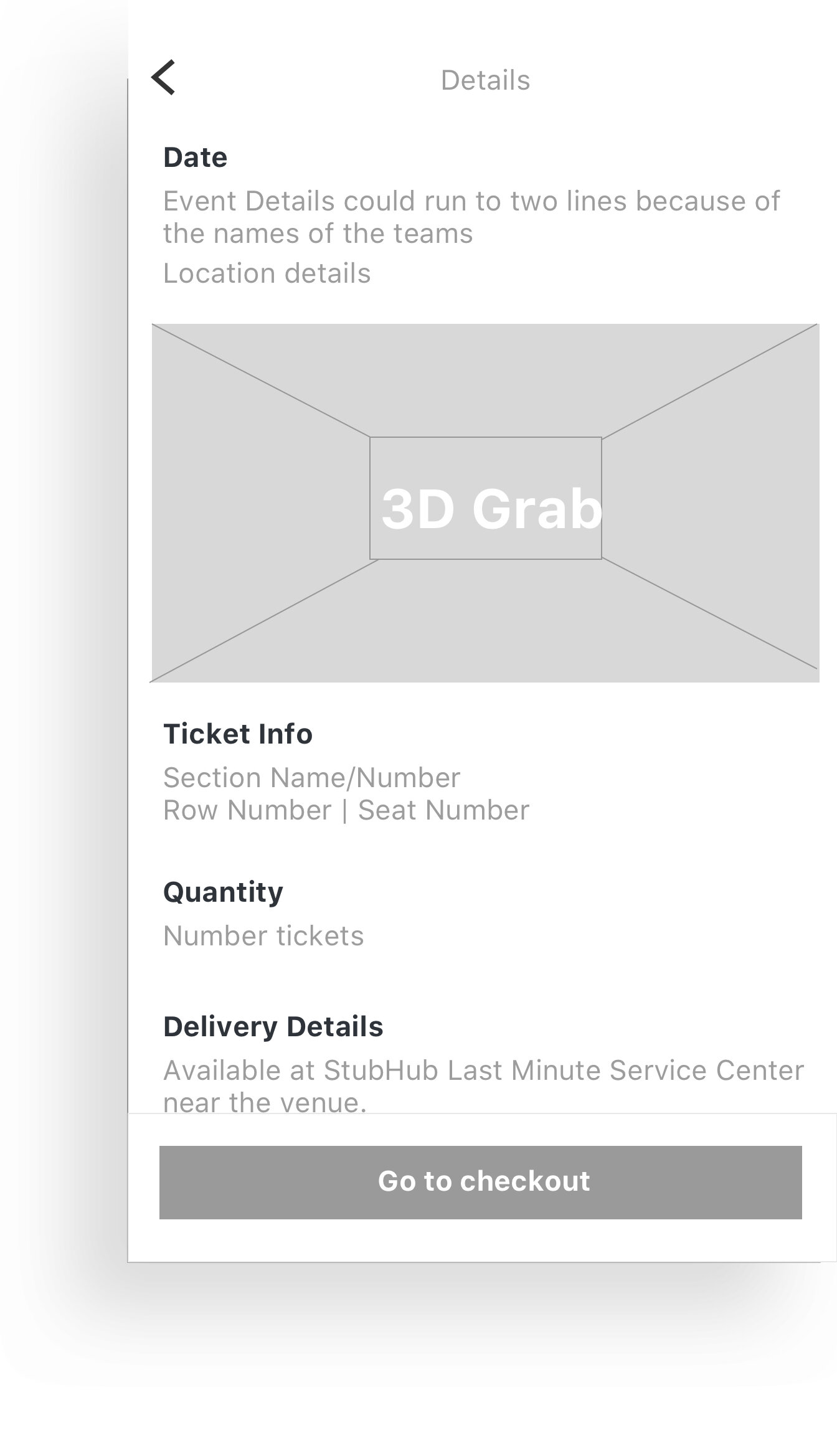
Using low-fi wireframes helped to facilitate conversations about the ideal user flow and helped our team identify edge cases (users who are not able to view the 3D map because of hardware limitations for example).
These wireframes correlate with the final user flow we identified in the section above.
Takeaway: limiting the number of steps in the user was a guiding principle. Pivoting from an AR build to a SceneKit build allowed us to reduce the flow to 3 key phases…1. Browsing Sections 2. Browsing Rows and 3. Selecting tickets/Viewing the 1st person. Getting users as quickly as possible from the stadium view into a purchase flow was critical because it allowed the details of the 3D map to shine and encouraged users to interact with the main benefit of the feature (1st person views of their very pricey tickets).
Why use feature cards?
There was a great deal of discussion and thought about how to reconcile the busy-ness of a 3D map and the utility of UI components. Feature cards are a specific type of UI component that pulls up from the bottom of the screen and is populated with details for the main screen content. Feature cards do well within the context of a map view by give supporting details without taking center stage. We settled on using feature cards for the following reasons:
Minimizing inputs
The UI components we were designing were 1-touch meaning that the views would change sequentially after just a single user input. Feature cards worked well for this because they would surface when an interaction was needed and would hide/be dismissed when the interaction ended. This made the experience much more efficient and giving precedent to full views of the map.Accessibility
Feature cards are easier to read and more accessible than opaque UI components (which were our other design direction) making our design more friendly to a variety of users.Reusability
Using a feature card would make this design extensible into other events (this is the reason we established a library of UI components) so we could apply this experience across StubHub’s app.
UI Kit
This UI kit was developed to help engineering spec the design work that would be needed. We used the existing native sketch file for most styling and I designed this component library to give StubHub the option to extend this feature into other events as needed. All the components designed were reusable.
You can see all of the components needed to create an AR Experience are there along with the critical 1-touch UI component: feature cards.
Error States
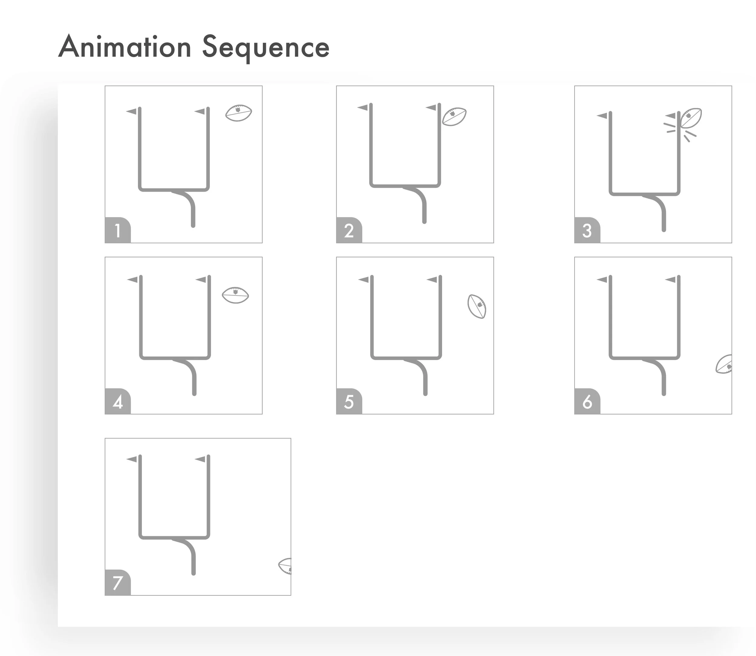
Just in case something breaks, I designed and illustrated micro-animation sequences for states that failed to load properly. I animated these in After Effects using traditional keyframe animation (no expressions) allowing Engineering to use Lottie to simply drop the animations directly into the app.
Production Screens
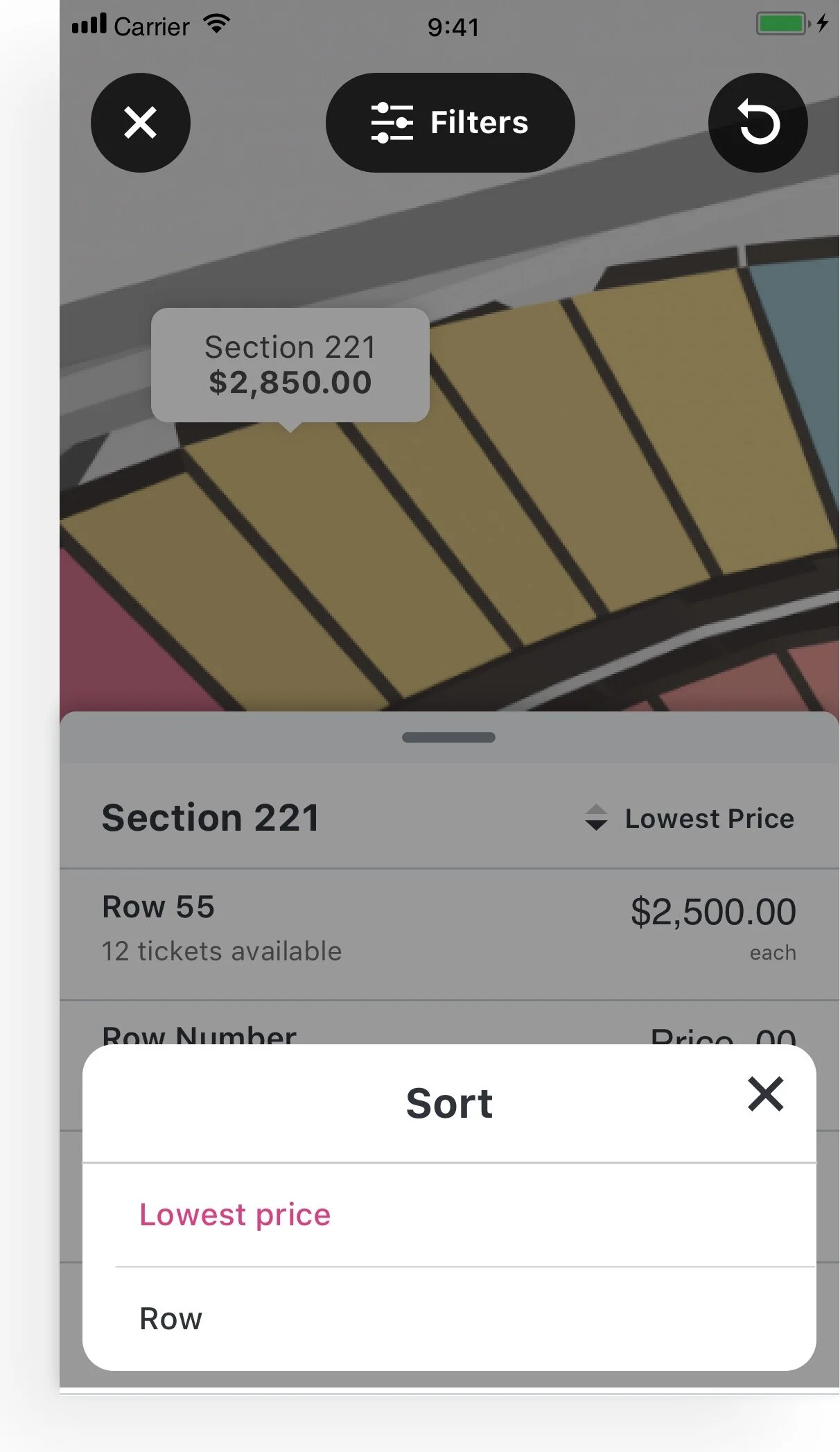
The final set of screens that we delivered were designed in a modular fashion to allow engineering to couple this experience with their existing checkout flow (rather than having to create an ad-hoc checkout experience for this single event). The last step was to connect this UI front-end to the full-resolution 3D rendering. That work was done 1 week prior to launch giving our teams sufficient time to unit test and debug code prior to pushing the feature live.
Final Product
Putting everything together we were able to provide the following output. The final experience provided 3 valuable takeaways for users:
An enhanced but efficient user flow giving users confidence to purchase tickets at a very high price
Elevating the quality of the mobile experience that matched the stature and circumstance of the event
Delight and personality through micro-interactions and immersive media
Shipped January 4, 2019
Aerial Views and section selection
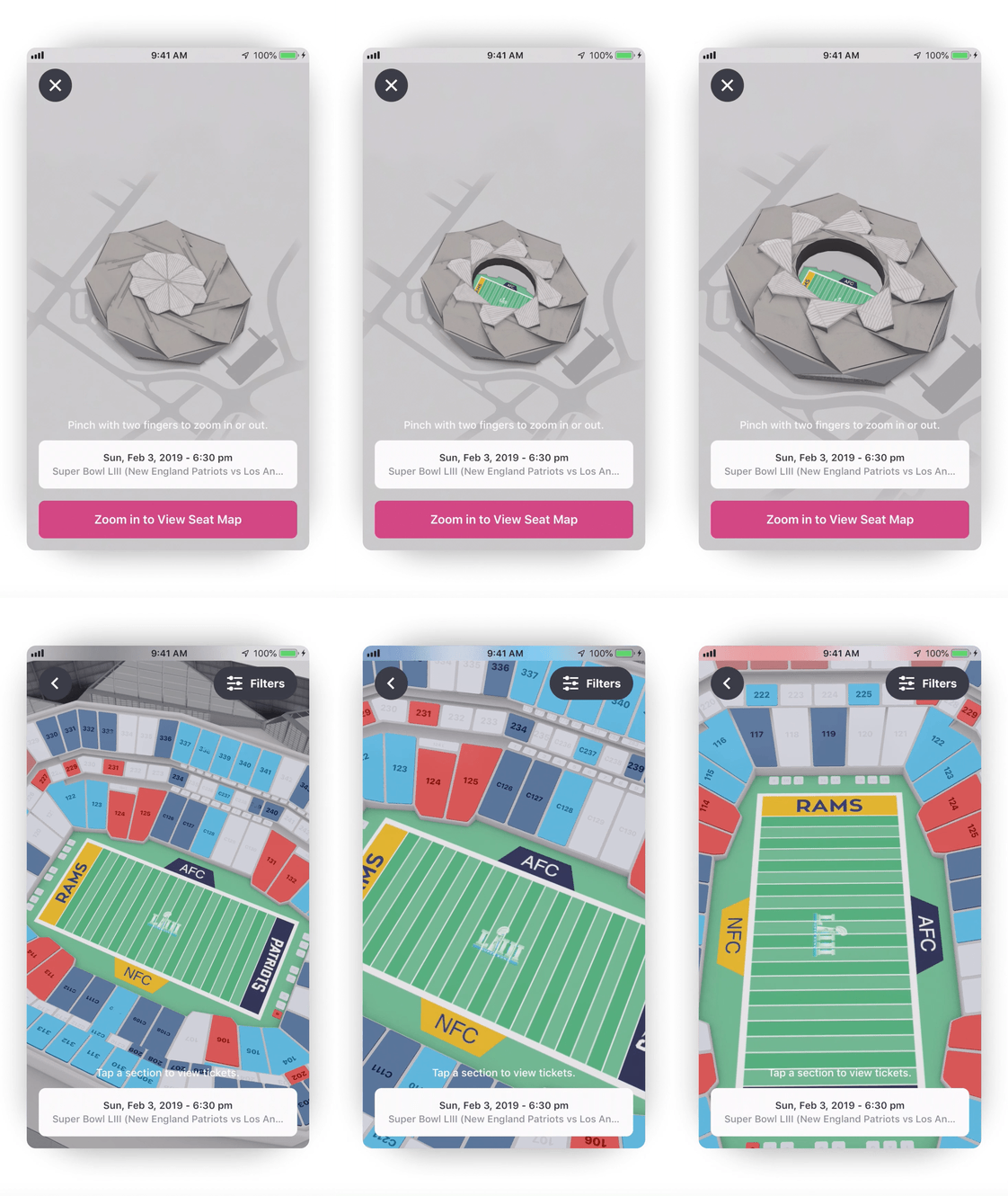
After entering filtering information (ticket quantity) and opting-in to the experience, a user is given aerial access to the 3D map. The final 3D map was high-resolution but not photographic. Providing just enough detail was critical. Future versions would contain merchandised ticket groupings (‘Best Value’, ‘Selling Quickly’, ‘Deluxe Suite’ etc).
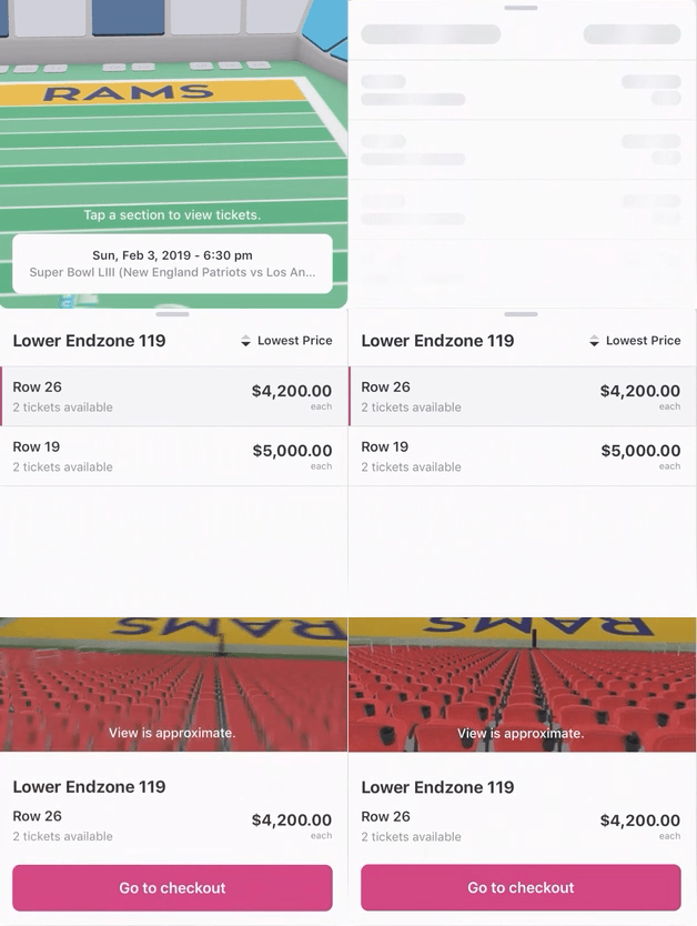
Feature cards and first person views
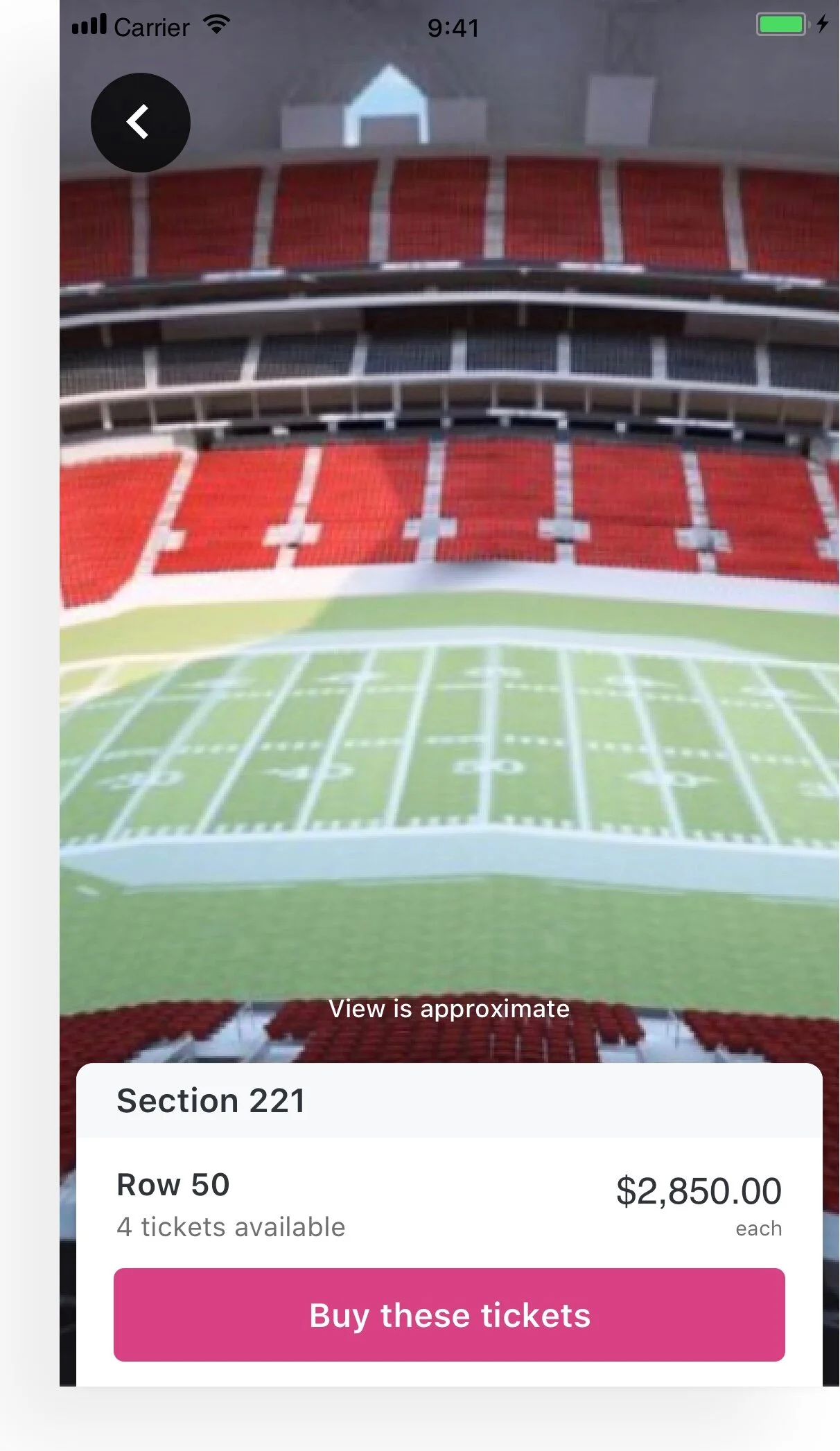
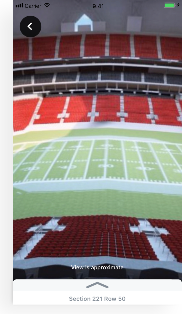
After selecting a section from the aerial view, the feature card is called with real-time inventory for that section. This is the real value of the feature. Users are given full control to pan left and right, up and down from their chosen row giving the most detailed views in any StubHub feature. From there users can sort/filter further or add to cart.
Summary
Delivering this feature to StubHub was an incredible experience for 3 primary reasons: Quality, Timeline and Reach. The resources and team that came together to make this feature possible were truly world-class. Engineering at StubHub partnered openly, worked with speedy technical proficiency and showcased every bit of the design that Prolific specified. The timeline was tight with just 12 weeks to go from concept to launch. Thanks to everyone who helped ship this feature.

