Paceline
Rewards marketplace powered by pedometer
Overview
At Prolific Interactive, there were 3 primary types of Service Offerings 1. Feature Development, 2. Mobile App Design 3. Venture Design. For this project (titled “Paceline”), Prolific assembled a Product Team to help a founder conceptualize, design and launch his business using an interactive prototype. Because this project was early stage, much of it is focused on concepts that make assumptions about our users, how the app would be used and the technology we could utilize to make it a reality. Much of my contributions here are focused on how to use design thinking to create user-centered experiences.
The idea: Paceline is a pedometer-powered rewards marketplace. Often times, fitness is an ongoing challenge in peoples’ lives that can become a burden. Paceline creates a transaction around workout sessions which translates into a monetary reward for ongoing fitness activity on a per user basis. This reinforcing mechanism would power additional workouts that would garner additional rewards creating a virtuous cycle improving fitness and quality of life.
My Role: Lead product designer (interactions / ui / UX) + User research
Platform: IOS App
TEAM: Engineering: quarkworks INC., Anil LODHIa (product manager), Dina Chaiffetz (product/business strategy), Krisha nalavati (ux/visual design)
CHALLENGE: Design interactive prototype for pedometer-based fitness rewards iOS app
TIMELINE:8 weeks
Timeline
Foundations + Explorations
Working with a first-time founder, I led design/UX-focused workshops with key stakeholders using Google’s Design Sprint Framework. Through this collaborative process, we focused on setting a foundation for the project. This meant defining 3 key areas:
Users
Who is our ‘best first user’
What are the problems that this app can solve for him/her/them?
Competitive Analysis
What does the competitive landscape look like?
Should this app be a fitness tracker first (with supporting rewards)?
Should this app be a rewards marketplace first (with supporting fitness capabilities)?
How do we bucket competitive offerings to give meaning to our assessments?
Interactions
What are the key user stories that we need to tell in order to articulate our founder’s vision?
Competitive Analysis
We organized competitor apps into “Primary”, “Secondary”, “Comparative” and “Partner”.
Primary = Apps/companies that are trying to solve the same problem as us.
Secondary = Apps/companies that are in the same sphere of influence but are solving a different subset of problems and/or using a different approach
Comparative = Apps/companies that are in a different sphere of influence but are solving problems in an entirely different context outside fitness (i.e. banking, e-com, games etc.)
Partner = Apps/companies that could serve to compliment/augment/support our ‘jobs to be done’.
At the end of this session our assessment looked like this:
Primary: Health IQ, Jon Hancock Vitality, YuLife, Blueshield365, Cigna, CXA
Secondary: ClassPass/Guava Pass, State Farm Cash Back Credit Card
Comparative: Boundless, PlayStudios
Partner: MindBody, Strava, Apple Health, Whoop, Garmin, Prime, FitBit
Crafting Proto-Personas
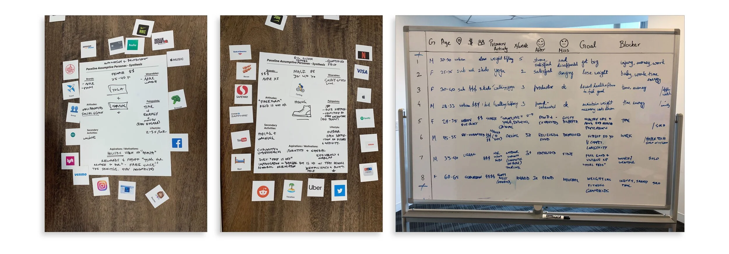
In order to begin defining our best first user, we had to make some assumptions. We began with stakeholder interviews, taking careful notes about how our founder envisioned the use of the product, defining the problem to be solved and then strategizing about how Paceline would fit into an existing fitness experience. I created these ‘Mad Lib’ style artifacts to help facilitate conversations and compile an early profile of our best first user. The key takeaway from this session, which included our founder and the Prolific Team, gave us a common source of truth (context and motivations) about our user that we would continually revisit and use as a baseline for our user sentiment testing.
Proto Persona Workshop
For this exercise, I used IDEO’s Human-Centered Design and Lean UX Design Thinking framework to make sure our direction was directly informed by user research and a feedback loop. In just 8 weeks we would perform 25 user interviews focusing on sentiment and usability.
Paceline’s Presumptive/Proto Personas
These were the two primary personas that we would reference throughout the project.
Takeaway: there are really 3 types of people who exercise as it relates to this project:
1. People who workout regularly no matter what
2. People who never/rarely workout (for various reasons)
3. Everyone else who falls somewhere in between on that spectrum.
Matt and Nicole fall somewhere in the meaty part of the curve. I created this very un-scientific visualization to help facilitate conversation about Matt and Nicole to help develop their personas.
User Stories
Using the ‘Jobs to be Done’ framework helped me to explore and conceptualize the different contexts that users would be using Paceline. It also helped our team develop empathy for our users and let us focus our explorations around feature-sets and key user flows. Continually focusing on user outcomes was helpful throughout the project.
Matt
Nicole
Identifying Pain Points
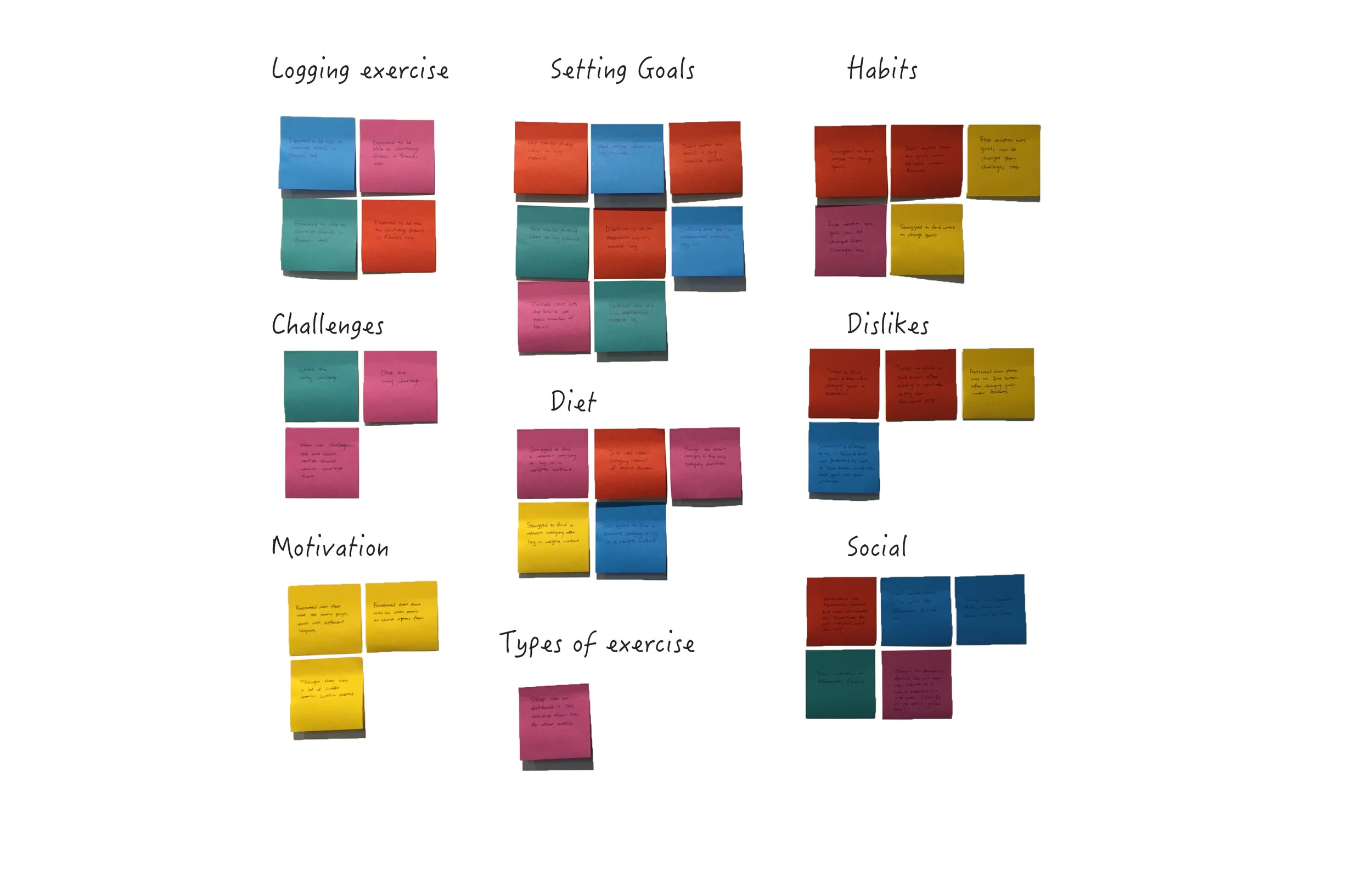
During a typical feature development project I would do usability testing with users or a heuristics evaluation to identify pain-points with the existing product. With a concept project, though, we had to rely on assumptions and sentiment interviews with potential users who demographically matched our presumptive personas. For the first round of interviews, we spoke to 4 Matt personas and 3 Nicole personas about their workout habits, the technology that they used to support their workouts and motivation. These formative conversations helped us to create an affinity map identifying both pain-points and things that supported the fitness habits of our personas.
“Before I got my Apple Watch I kind of hated the idea of it. Since I got it, I’ve tracked all but one of my workouts over the last year.”
“My mom reminds me every time I talk to her about Starbucks double rewards points.”
Takeaway: There was room for an app like Paceline for a particular subset of “fitness” persona. People who tended to struggle with motivation and didn’t have a strong categorical affinity (generalist or multi-dimensional types) were the most empowered by the concept. People who matched the “Nicole” persona were much more receptive to the “fitness-rewards” model because of past experiences with points-based member rewards from national retailers like Starbucks.
Personalization, Trust, Integration and Timeliness
Through our conversations with potential users we uncovered four significant themes which would serve as our guiding principles in the design process: Personalization, Trust, Integration and Timelieness.
How do these princples translate into design?
Personalization
Most users have an affinity for a particular type of workout (social, solo, cycling, running, swimming, yoga etc). Focusing the experience around a profile that relates to this activity and meets users where they are is key. This also informs the types of rewards.
Trust
Skepticism around “rewards” marketplaces was widespread among all user types. Bringing a concrete reward to users early on in their experience was a critical touch-point in developing trust and establishing Paceline as a legitimate app. This was also a key to establishing Paceline as a valued part of users’ fitness workflow.
Integrations and key partnerships.
Most users have an established fitness workflow if they are using a piece of workout hardware (pedometers, altimeters etc.) that is already paired to a favored workout tracker (Strava, FitBit, Apple Health or other). Integrating with those key partners would make or break the experience for our users.
Timelieness
Nicole did not want to wait for a reward to be shipped for her. The more we could reduce the amount of time between the action and the reward, the more likely it would be for users to be satisfied with the experience.
User Flows
After we had defined the user, we could then move onto looking into the practical user flows that were critical to communicating the founder’s vision. I often rely on user stories to help identify the key states and screens that we need to design, identify pain points and outline an aggregated view of the user experience. I summarize this work as ‘interaction design’ which is a fancy way of saying “What are the touchpoints that the user has with your product?”. We solve problems from there.
The key flows we identified were:
Onboarding
Home screens (compiling and aggregating fitness data)
Rewards + Redemption
Fitness Tracking
Style Guide
Creating a simple style guide that included a sexy color palette, iconography, usage guidelines and typography scale gave us the ability to begin designing components. The component library would be used to build out future screens as the product matured into Beta and Production phases, respectively.
Key Screen Wireframes
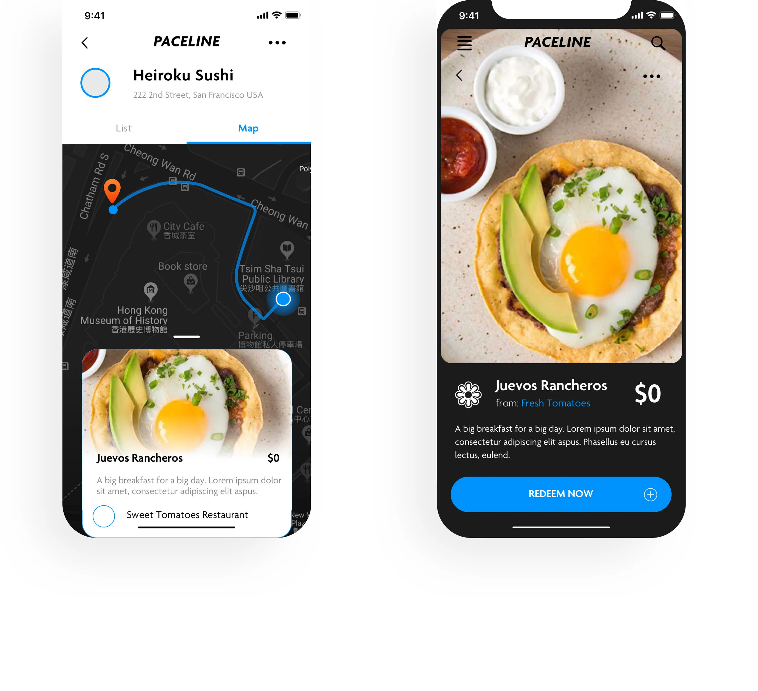
Production Screens
The final set of screens that were delivered to the client via an interactive prototype are included here. Using this set of screens the client was able to secure funding for a seed round and launch his business. This product is now in Beta, the company has made it’s first critical hires (a PM and a Product Director) and the app is expected to launch in early 2020.


