Glassdoor Illustrations + Onboarding
My first love is illustration and I get out a lot of my creative energy in my free time with a sketchpad and pencil. Bringing product development and illustration together is a very special opportunity. At Glassdoor, I led the development of our current illustration style and personally created a set of visual guidelines to help express the our design and brand principles. I worked with our Marketing VP and Head of Product to develop an illustration style that allowed Glassdoor to communicate to users in a totally different way than they could with photography alone. You can read more about the Glassdoor Illustration Guidelines HERE.
My Role: Creative/Art Direction, Illustration, Interface Design
Dogs = Home
As a pup-friendly office, Glassdoor has special reverence for our doggy friends. Building in the concept of "Anatars" (animals that could be slightly anthropomorphized) gave us the ability to de-prioritize politics and focus on universal archetypes. Making our style personal and genuine was of the utmost importance.
Where you are + What you do
Another theme that came through our brainstorm sessions was a focus on where and what users are doing on Glassdoor. The location and nature of work is something that holds a lot of emotional energy for people. The opportunity to reinforce some affinity for “Place” was emphasized with location-specific hero images.
Onboarding New Users
Compelling users to register is just the first step in building engaging user experiences. Proving the worth of your product to them via a well though-out onboarding process is a proven strategy for making good on that promise. I worked with our Product Lead and a Product Manager and 2 front-end engineers to design, prototype, and implement an entirely new onboarding experience.
OBJECTIVE: CREATE onboarding UI that quickly moves users into product feature of their choice
MY ROLE: ART DIRECTION, INTERFACE DESIGN, USER TESTING, VISUAL/INTERACTION DESIGN
CHANNELS: IOS // MOBILE WEB // ANDROID // DESKTOP
TIMELINE: 2 MONTHS
CHALLENGE
Improve user engagement for newly registered users by redesigning the existing onboarding flow.
RESEARCH + SURVEYS
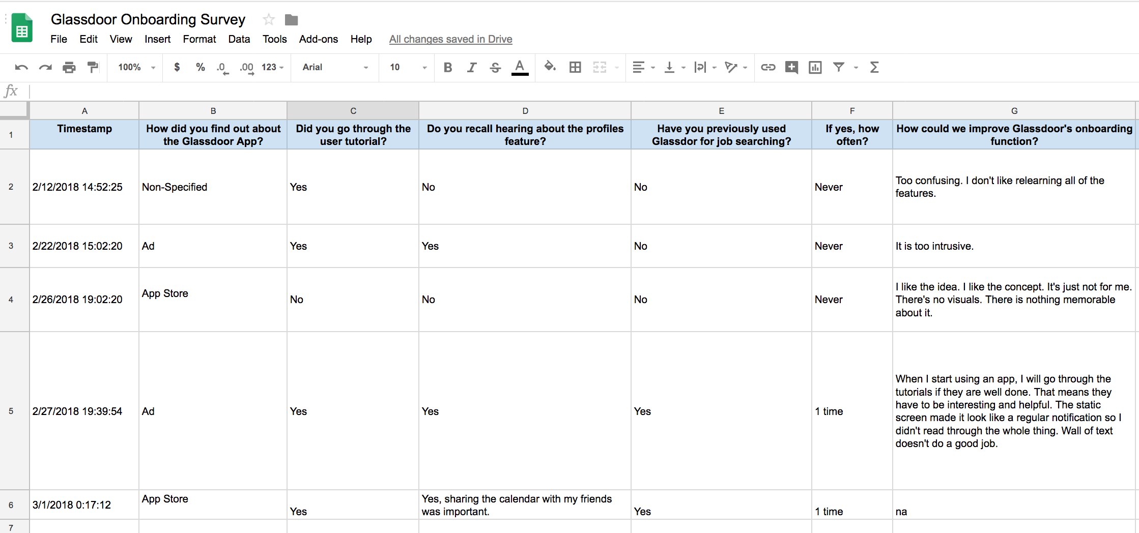
In order to find out what was wrong with the existing modal we did some user research. We knew that there were a few things within the modal interaction that could be improved (sequence/order of features, illustration/iconography, language, layout etc.) but we needed user insight to develop priorities. I put together a simple survey which was conducted using a small focus group of 25 users who had agreed to help us.
PROCESS
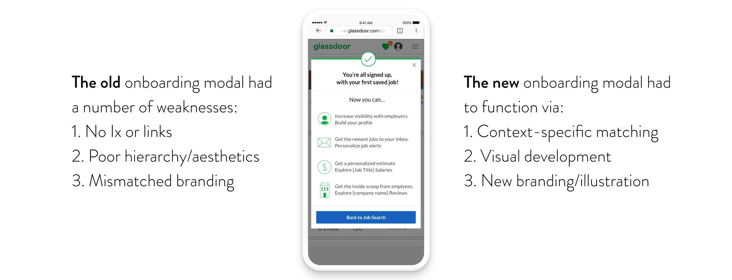
Through the user survey it became very clear that biggest pain point for users was that the old modal was not hyperlinked to any product features. Research pointed to "Wall of Text", "Stupid" and "Underdeveloped" as common adjectives that described the existing modal. Ouch. The modal wasn't informative enough and didn't allow users to engage. Essentially there was no interaction. The existing onboarding modal was a static image that was not hyperlinked or active and visually read as a display ad due to it's text-heavy layout and it's square-ish form factor. My user research confirmed our initial hunches and gave us the concrete evidence we needed to do a full tear down.
This was a great opportunity to redefine the way that illustration could live within the product to improve engagement.
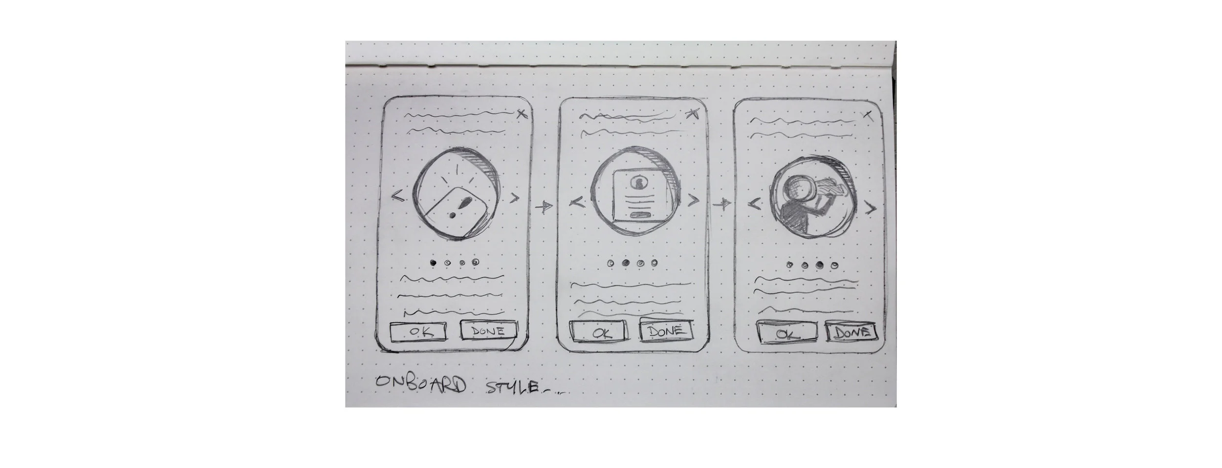
A simple swiping interaction that had artwork revealed through portholes was a gesture to the "transparency" of Glassdoor's Product Design principles.
A high fidelity version composed with each of the features that we wanted to guide users towards (‘Profiles‘, ‘Job Alerts‘ and ‘Know Your Worth Tool‘).


