Glassdoor Design System
One of my first projects at Glassdoor was translating their new branding onto our mobile and desktop products. I worked with the Product Design team, our internal Brand Team, 2 iOS engineers and 1 Android engineer to help execute and launch the rebrand. Primary efforts were to re-layout the type throughout the product to enhance readability and to re-prioritize visual hierarchy as a central component to the experience.
Objective: Apply visual design system to existing product
My Role: Art Direction, Interface Design, Project Management, Visual Design/Layout
Channels: iOs // Mobile Web // Android // Desktop
Timeline: 6 months
TEAM: Christian Bentley, Michael Chambers, Shawn cook, Seva Dyakov, Jennifer Gieber, Jessica Liu, Justin marine, Jille Natalino, pavel Rakhlin
CHALLENGE:
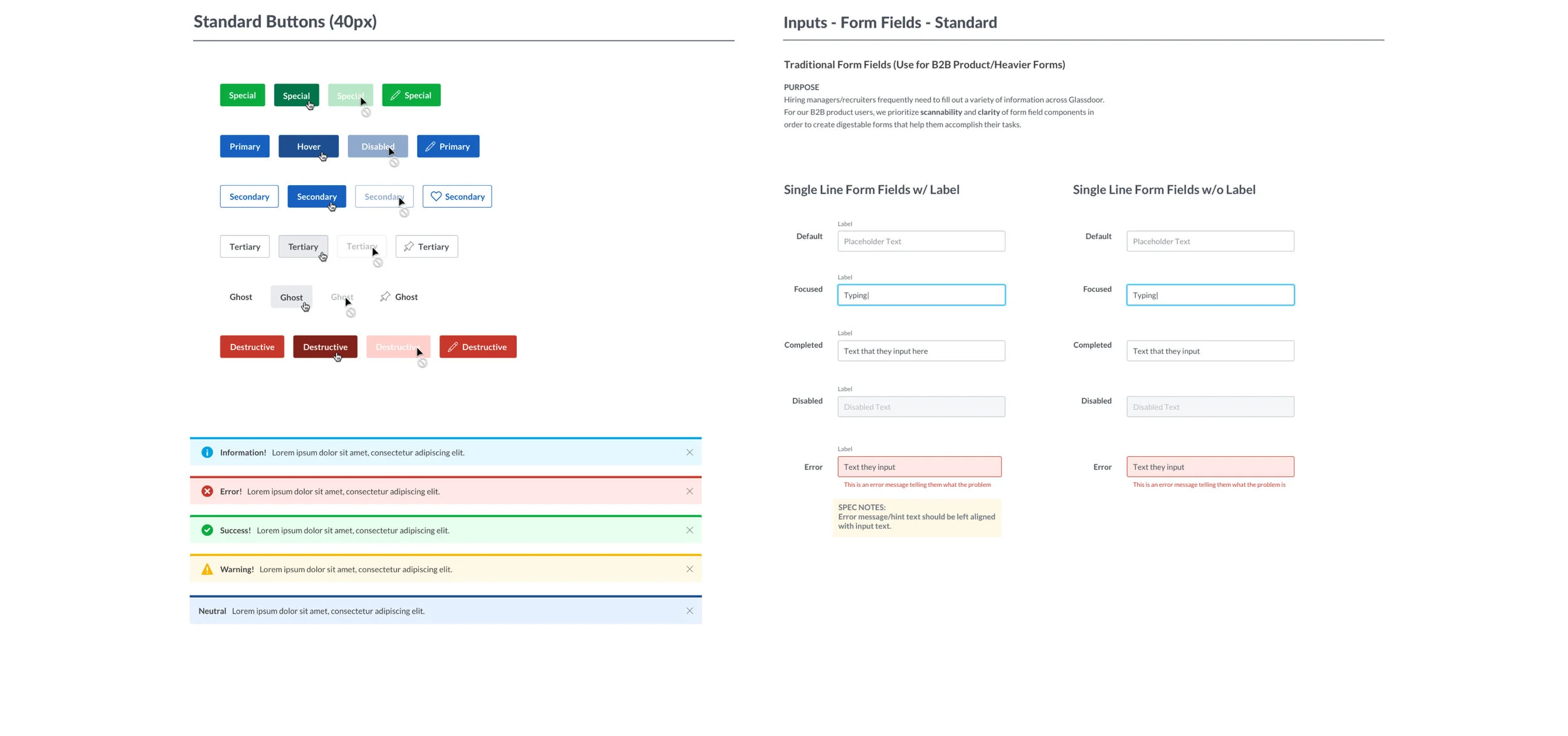
Create a Product Design system that can be used across the design organization. Use recently rebranded identity system to standardize UI components.
High-traffic pages like company profiles were a critical area of focus. The task of re-laying out the type allowed us to make these pages more easily consumable which boosted engagement and click-throughs to jobs.
The "Know Your Worth" tool (which gives users a US Dollar figure to help during pay negotiations) was important because it included so many design elements. This feature was at the intersection of many areas of the re-design: data visualization, grid and layout, content alignment/spacing and button styles. So much of what we decided here helped inform downstream choices we would make for mobile and desktop.
Introducing bolder colors from the new palette and doing a thorough clean-up of frequently used screens was a great opportunity to inject illustration into product. This illustration style (developed and produced by me) is used across Product and Marketing.
PROCESS
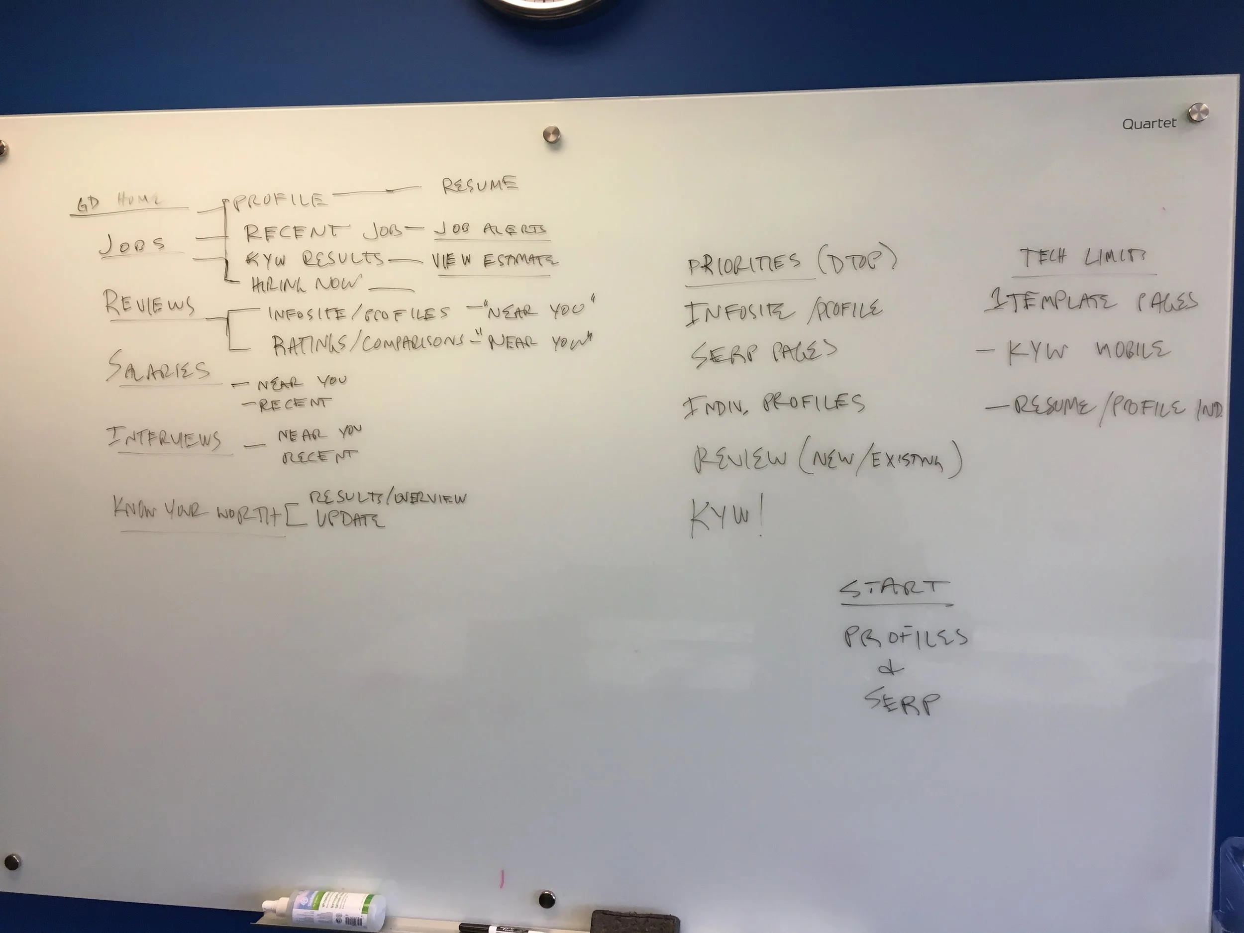
We began with breaking the app down into its main pieces. We were on a tight deadline so we needed to prioritize what HAD to change in order to make the most visual impact while keeping the design and engineering teams sane. We ranked each element by design difficulty and made an educated guess at technical difficulty. After confirming the technical difficulty with engineering we were able to create a pretty accurate priority list of when things needed to be worked on.
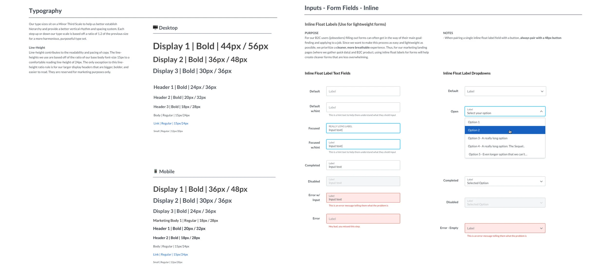
Once we established the areas that had the highest amount of visual impact and the least amount of tech challenges (namely areas of legacy code that weren't on any type of existing backend template) we began the mammoth task of implementing Lato (our new typeface) into the desktop and mobile products. This was far more complex than we had anticipated since much of our code based was spanning almost a decade of development. Sorting out how to best divide up the areas that needed to be modified by hand was critical. Additionally, we had to create a set of visual guidelines specifically with out type. We wanted to implement a grid system but this was out of scope so we simply began with a minor thirds type scale.
This quickly lead into a discussion of a larger scale design system...a perfect example of slowing down to speed up. We made the tough decision to add an additional 2 weeks onto our timeline so we could pause and really examine a system of design and visuals which could be used as a foundation for our product. Though, this idea was particularly popular (since it meant pushing back timelines), it was definitely the right decision since it suited our primary need: doing it right the first time.
HOW IS A DESIGN SYSTEM BUILT?
TV CAMPAIGN
The re-brand was a global effort at Glassdoor that spanned Product Design, Engineering, Marketing, Sales and IT (even Facilities and Janitorial got involved). Because of the vast reach and impact of the changes we were making, we spent an entire month preparing to flip the switch on the new design release. When we finally sent the changes to go live we had a huge party which kicked off another month of making final adjustments to the product (both desktop and mobile) to fully standardize the visual changes.
Working on a national TV campaign was a special thrill. In addition to helping shape the art direction and branding elements of this piece, I personally worked on creating the Product close-ups to demonstrate the functionality and features of the product.
DESKTOP PRODUCT SHOTS


